Wednesday, 13 April 2011

Evaluation of Music Magazine

Evaluation of Music Magazine


The aim of this task was to create a music magazine of your own chosen genre including 4 original images. The genre I chose was Dance and R&B. We had to create a front cover, contents page and double page spread. I decided to make my music magazine very conventional for a Dance & R&B magazine. On the front cover I made my masthead ‘PULSE’ very bold and simple making it easy to read and easily recognisable. I decided to call my magazine ‘PULSE’ because loud music pulsates through your body when at a club. I dressed the model so that she looks as though she is on a beach; this represents my genre as dance music is often related to clubbing holidays. I made the cover lines contrast against the background so they are easily visible. I chose to make the main cover lines match the colours used in the main image (pink) to show continuity as bright colours are conventional for this genre. I chose to add a bar code and prices to the front cover to make the magazine look more realistic and to show how much a dance magazine usually costs. On the contents page I used similar bright colours throughout to show continuity from the front cover. I chose the font of the contents masthead to be more similar to the fonts of other dance & R&B magazines. I decided to add the monthly issue at the top of the contents to show that its supposed to be a summer issue which links to the front cover main image been on a beach. I added more bright colours such as green, yellow and pink to the layout of the contents and used a different colour for each separate headings. I did this to brighten up the page and because it’s conventional for a dance magazine to be colourful. I chose to make the page numbers a clearer font than the cover lines so that the page numbers stand out from the cover lines. I chose the 4 main images carefully; there are images of an R&B artist, a ‘wild’ party, a nightclub and the model on the front on a beach. The picture of the girl on the beach shows continuity from the front cover. The picture of the R&B artist is larger than the other images as this is the dominant image as it’s the main article in the magazine. The other two images were to show the genre of this magazine. All these images are very conventional for both dance and R&B and as my magazine is a mixture of these two genres I had to use both types of images for my contents. My double page spread is very clearly spread out, one page is just the main image, and the second page is the text. I did this as it’s conventional for an R&B magazine such as ‘XL’ and ‘VIBE’ and makes it clearer to read. The full page is very blue as the model is supposed to be in a nightclub. I decided to photograph the model under blue Christmas lights to create this illusion and changed the background to a nightclub scene. I dressed the model in clothes which are usually worn by R&B stars i.e. vest, baggy jeans, hat and crucifix chain. This created realism and I think made the model a convincing R&B artist. The masthead for my double page spread is a quote from the text; I did this to make the reader want to know what’s happened in the life of this artist. I decided to use different sized typography and different fonts for the questions asked by the interviewer to make it clear for the reader that this is an interview. At the left of the artist I put his name down the side of the page to show the reader who this interview is about and advertises the artist.

Looking at my front cover you can tell that my music magazine represents my target audience (ages 18-30) as it has a young woman as the main image and the cover lines would be of interest to this audience. I also wanted this magazine to be seen as more appealing to the male gender I did this by dressing the women on the front in not wearing many clothes. I chose this target audience as it’s mainly people aged 18-30 that go clubbing and go to places such as Ibiza. It also says on the front cover that the magazine offers a club guide which would appeal to this targeted audience. This is conventional for a Dance and an R&B magazine as in my earlier research I found that all the magazines I analysed had a targeted audience of ages 18-30. From my contents page you can tell that it relates to my targeted audience as everyone in the images are in the age group of my targeted audience. The cover lines and features of the contents would also appeal to my targeted audience for example ‘best raves in the land’ would appeal to this age group because they might want to go to these ‘raves’. I think that my double page spread would be of interest to my targeted audience as they may want to know how this particular successful artist started out and get ideas on how to start out in the music industry. This audience could also relate to references included in my text such as ‘MySpace’ and may also be an ‘Eminem’ fan.

The magazine iDJ is very similar to my magazine, it’s distributed by Comag and therefore Comag wouldn’t want to distribute another magazine of the same genre. However the institution IPC media could distribute my media product as it only publishes one other music magazine which is NME and this is of a different genre to mine. NME is one of the most popular music magazines it now has 5.3 million monthly subscribers and its website is the largest magazine website in the UK. The NME is aimed at a younger audience and so is my magazine PULSE therefore I think IPC media could be a perfect distributor for my magazine and could help make it as popular as NME.

The audience for my magazine is young male and females between the ages of 18-30 who live a sociable lifestyle. It is aimed at people who have no worries and no bills to pay for and can just spend there money on going on clubbing holidays such as Ibiza. It could be aimed more at single people as they are the type to go on clubbing holidays with groups of friends. My magazine attracts males more than females as they tend to like other male R&B artists more than females do and looking at the front cover males are more likely to pick up the magazine. I tried to attract my targeted audience to the front cover as it looks as though it’s in a hot destination and the bold pink writing of Ibiza stands out straight away and makes the reader want to know what’s happening in Ibiza this year. One of the cover lines also says ‘your chance to win tickets to Pacha Ibiza’ this would make my target audience want to buy this magazine as they could win tickets that they would usually have to pay for at a very high price. The price of the magazine is very reasonable this could attract the audience as the magazine has a lot of content.

Whilst constructing this media product (my music magazine) I have learnt how to use adobe Photoshop to a higher extent. I used Photoshop because it’s easy to use and very professional as there are loads of image editing techniques available. I used Photoshop for this project because it allowed me to edit the images to exactly how I wanted them by cropping, brightening and enlarging them to the size I needed. Blogger is a blog-publishing service that allows private or multi-user blogs with time-stamped entries. As my work was created over a period of 5 months, I used blogger regularly to post my work and keep my work up to date. This allowed other students to look at my work and allowed my teacher to see how my work has progressed over the 5 months of production and give me advice on what could be changed. I used blogger to post my selection of original images and then decided which images to choose for my magazine.

Looking back at creating my college magazine at the beginning of the year it helped me get used to Photoshop. I did lots of research into magazines to learn the conventions of magazines for example were the masthead should be and why to put images and cover lines in certain places. It helped me understand genres of magazines, this really helped me when I was creating my music magazine as I knew what to research and had already learnt the terminology. When creating my college magazine I rushed taking the images and didn’t get the images I wanted. This time I decided to take a greater variation of images and chose the best ones to use for my magazine. I have progressed since making my college magazine because now I am able to use Photoshop to a higher extent.

I created a questionnaire and printed off 10 copies and gave them to a varied audience to fill in as feedback for my product. 8/10 of the audience recognised that the genre of my magazine had a dance element. Everyone said that they would like to buy this magazine because of the front cover and the contents page. Some stated that judging from the front cover the magazine would appeal more to males but still appeals to the targeted audience. This is how I wanted my magazine to come across. None of the audience feedback suggested any improvement to my front cover this shows that my front cover is conventional for a dance music magazine. From the audience feedback I found that they thought that my masthead and main image worked well together and that the contents page had a very clear layout. The feedback for my contents page showed that the audience recognised the dance and R&B genre I have chosen for my magazine. Someone said that the contents page title could have been improved; I think I could have chosen a clearer font that is more relevant to my genre of music magazine. From the double page spread the audience feedback shows that the R&B genre is easily recognised because of the artists (models) clothes, posture, the typography being graffiti and the nightclub background which all connote rapping and gangsters. The double page spread has also been said to be targeted more at a male audience I think that this is true as they are more interested in this kind of music and that is what I intended to do. From the feedback I found that I could have improved the double page spread by including more questions in the interview and making it less brief.

From creating this media project I have gained crucial skills. I have become more confident using Photoshop and have learnt how to use www.blogger.com to post up my work. I am now confident with taking photographs and editing them in a way in which I want them to look.

Monday, 21 March 2011

My Questionnaire

Audience Feedback


From this front cover, what genre would you think this magazine is?


Does this front cover make you want to buy this magazine?


Do you think this front cover appeals to the targeted audience?


What do you think could be improved?


Looking at the contents page would you buy this magazine?


Do you think the contents is clear?


What genre of music would you think this magazine is looking at this contents page?


What do you think could be improved?


Looking at the double page spread, what genre would you think this magazine
is?


What type of artist do you think he is and why?


Is the double page spread clear and effective? If so, Why?


How do you think the double page spread could be improved

Thursday, 10 March 2011

Front Cover, Contents Page, Double Page Spread


Double Page Spread

I decided to change the opacity of the white background behind the text to make it look more realistic and to be able to see the background image as its in a club which relates to the magazine genre.

Tuesday, 8 March 2011

Double page spread so far


This is my double page spread so far. I havnt decided wether to change the background or just change the white background of the text to make it look more realistic. 

Monday, 7 March 2011

Contents Page Finished


I added more features to make it look like an obvious contents page and made it more conventional by adding more colour but I'm not sure if I am going to change some of the colours yet.

Thursday, 3 March 2011

Contents updated

Photos for Contents


 These first 3 images dont have very good lighting for a beach so i decided to try and make the lighting better so its easier to edit.


Contents page so far...

I have added a masthead and headings, and added colour to make my magazine more conventional for my genre. I still need to take some more photos for a picture at the bottom of the contents.

Thursday, 17 February 2011

Contents Page Started...

I need to add text, colour and decide wether to use all of the photos.

Thursday, 16 December 2010

Text written for double page spread


‘Life without drugs, guns and violence’

MySpace gave Chris Parker a chance to get known. He was new to the social networking phenomenon only one year ago and since has become one of the biggest music success stories ever found through MySpace. Now being one of the new big names in R&B he is used to a life of luxury. before fame the newly named R&B superstar was living a life of crime as one of the New York’s youngest gangster.

‘I thought my life was F**ked, I had no money, I was a wasted talent living on the streets. Nobody gave a F**k. I needed a new life without drugs, guns and violence.’
Since then his album ‘Discovered’ hit number 1 in the UK and US and also hit number 1 rap chart. He has said to be the new Eminem of this century.

What do you think to been compared to Eminem?
Its incredible. Thought I don’t agree with the comparisons. No white rapper will ever be as successful as him and I’d say I’m no were near as talented as him. But I’m flattered.

So your albums called ‘Discovered’, why ‘Discovered’?
Well me and the producers picked this title straight away. It was appropriate, sincere and relevant. I felt that I’d been discovered now and that I had discovered what I want my life to be like now. F**k going back to that S**thole I came from.

I take it your not proud of your past, but would you change it?
I’m not proud of what I’ve done in the past but I had my reasons and I know that’s no excuse but I’ve been punished for the crimes I’ve done in the past and I’ve done my time. I wouldn’t say I’d change it because its made me a better person today. I don’t live to regret and dwell on the past.

What made you change your ways, did anyone direct you in the right path?
I thought my life was F**ked, I had no money, I was a wasted talent living on the streets. Nobody gave a F**k. I needed a new life without drugs, guns and violence. I didn’t need anyone to direct me, I knew what I had to do but I just didn’t know how to do it. I got in touch with bars and clubs and auditioned to be a rapper. That’s were I got spotted.


Wednesday, 24 November 2010

Photographs

 These are the photographs I have taken for my front cover of my music magazine, I made her wear beachwear as my main image is of a girl on a beach.


These are the images for my contents page. I took these images at nightclubs:


These are the photographs I have taken to choose from for my Double page spread about a new R&B star, I chose to take the images under a blue light to make it look as though he has been photographed in a nightclub:

Initial and Draft Ideas

These are the draft layouts of my front cover, contents page and double page spread of my Dance and R&B Music Magazine:
Front Cover


Contents page


Double page spread

Masthead Ideas

This is a list of ideas I have come up with that I could use for my masthead:

In the mix
D&R&B central
Club Essential
Volume
Pulse
Mix Mash
Mash Up
Essance


Fonts.

These are the different fonts I thought about using for my magazine masthead:

LIIAR Analysis of 3 Music Magazines


DJ Mag:

On the front cover of ‘DJ magazine’ the language used is very clever. The masthead is in the top right hand corner, it’s a very short masthead and it’s red and bold. This magazine is very conventional, the main image is a medium shot and covers some of the masthead, and this shows that the magazine is confident that it will still be recognised. The cover lines are on both left and right sides of the image covering the bottom half of the image. The colour of the cover lines match the masthead, they are all very clear and easy to read. The main cover lines are slightly bigger and bolder than the rest. The main image is very well thought out and professional it looks as though it was taken in a studio and the models have been dressed like that on purpose. The dress code is very camp and the men in the photos are wearing makeup. The colour of the cover lines match the colour of the clothes the models are wearing, this makes the front cover look mainly yellow and red and easily recognisable. We can tell from the front cover that this magazine is aimed at the younger generation, mainly ages 18-30 worldwide.

DJ Mag is a monthly magazine, first printed in 1991, dedicated to dance music. The magazine is available through newsagents worldwide, via subscription and as an online pdf. Each issue comes with a free CD. DJ Mag is currently published under licence by Thrust Publishing Ltd.

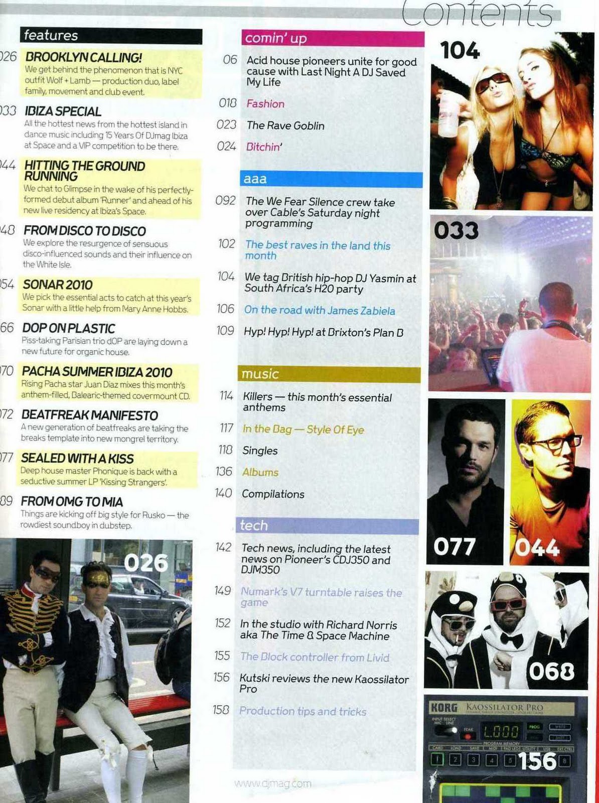
The contents page is very simple yet colourful and tells us exactly what we are going to be reading about in the magazine. It’s split up into 5 categories: features, Comin’ up, aaa, music and tech. You can tell that the magazine is aimed at younger people by the way the writers have spelt comin’ up. The Magazine represents the dance music industry and the nightlife surrounded by it e.g. productions/holidays (Ibiza). There are images surrounding the contents and these images are mainly photos of DJs/clubbers aged between 18-30.

The double page spread uses much of the same language as the front cover and contents page. It’s kept very simple and the main image on the double page spread has the same models as the front cover and contents this suggests that they are popular artists and are the main focus of that pacific magazine.


Mixmag:

On the front cover of Mixmag the language is very busy but effective. The main image is of a spectacular show, this links with the main cover line ‘The most amazing shows in dance music!’ this tells the audience straight away that this magazine is about dance music. The masthead and many of the cover lines are the same bright orange/red colour. The main focus of the main image is the DJ wearing a neon coloured mask, the DJ is just below the masthead so the most important part of the front cover is the top half. The bottom half is very bare and the cover lines don’t stand out as much meaning they are less important. The barcode is in the bottom right hand side and it tells the audience how much the magazine costs. We can tell from the simple masthead that this is very easily recognisable because of the dot on top of the ‘i’ which makes it unique.

Mixmag has competitions were readers can win great prizes and gives the readers knowledge of big upcoming dance music events e.g. deadmau5. Mixmag was launched in 1982 and were the creators of the dance music magazines market.
 *It is the market leader and has maintained its reputation as the most influential title in the dance sector. It created the words “superclub” and “trip hop”, released the first legal DJ mix tapes and CDs and is the most trusted voice in dance music.
Mixmag was acquired by independent publishers Development Hell Ltd in December 2005 and re-launched in April 2006.
Over the past six years the UK dance scene has grown up and become more aspirational, reconnecting with its roots in glamour and the underground. The relaunch of Mixmag reflects this with better production values, glossier paper and the return of a perfect bound spine.
The Burberry caps, downmarket “mates in a state” pictures and wall-to-wall drugs features are gone. In comes stylish, grown-up writing from some of Britain’s best music writers, a commitment to exciting new music – from electronica to house to urban and beyond – visually stunning directional fashion and the world’s greatest guide to planning your best nights out in the UK and elsewhere.
Today’s clubbers are more sophisticated, more broadminded and – let’s face it – sexier than the days of the mega clubs and mass marketing. Mixmag is their magazine, reflecting their more cultured, more elitist but no less hedonistic approach to a good night out.
Mixmag will continue to come with its world-famous series of free cover CD’s mixed by the best DJ’s in the world.
Mixmag has a certified circulation of 30,817 and a readership of 276,000.
Mixmag continues to be the only audited dance/clubbing magazine in the UK, and the biggest selling in the world. (http://www.mixmag.net/welcome-mixmag/)

Mixmag is mainly aimed at the same audience as DJ mag – 18-30 male and female clubbers.

The contents page for Mixmag has an odd layout as there is a main image of 2 party goers in a club. It shows who the target audience is. This takes up most of the page and the cover line at the bottom explains the image, it says ‘your complete party guide’, this seems to be very conventional for a dance magazine. The background of the contents is black; this suggests that it’s a magazine about nightlife. At the bottom of the contents there is a list of songs which are on the CD the magazine gives free to every reader. So it isn’t just the contents of the magazine on this page. The Mixmag logo is also on the contents as is the issue date. 

The double page spread from Mix mag is a mixture of text and images. There are 2 main images of amazing dance music shows and the images are very similar. One of the main articles is about Deadmau5 which seems to be a main focus throughout the magazine. I think these images advertise these types of events to their target audience because they make them look spectacular and people will want to go to them. The text is very plain and clear with lots of detail.


XXL:


The language is very plain and simple on the front cover of XXL. The background is a light grey which helps to make the black cover lines stand out. The main image is a very professional mid shot and looks very well thought out because of the costume, lighting and even the body language. The colour of skin, jewellery, tattoos and clothes all tell the audience instantly that this is an R&B magazine. The main cover line explains the image and tells the audience who they are. The masthead isn’t very noticeable in this front cover as some of it is covered by the main image and it looks as though its part of the cover lines. This shows that the magazine is very well known and doesn’t need to advertise themselves. The barcode tells us how much the magazine is to buy.

*In 1997, XXL was founded by former Source staffers as well as other Harris Publication employees, who wanted to create their own magazine about the hip-hop music and culture using the model developed by the founders of The Source. The magazine's past editors included Elliott Wilson (formerly of Ego Trip Magazine and The Source) and Datwon Thomas (former Editor-In-Chief of King Magazine). In May 2009 Datwon Thomas resigned from XXL and executive editor Vanessa Satten, who had been with XXL since 1998, was named the new Editor-in-Chief.
In December 2006, XXL took over the struggling Hip-Hop producer and DJ magazine Scratch (another publication owned by Harris Publications), re-branding it as "XXL Presents Scratch Magazine". Scratch shut down in September 2007. Other titles with limited runs have been launched under the XXL brand, including Hip-Hop Soul, Eye Candy and Shade45. XXL has released many other special projects including tour programs, mix tapes and exclusive DVDs. XXL also maintains a popular website, which provides daily hip-hop news, original content and content from the magazine.

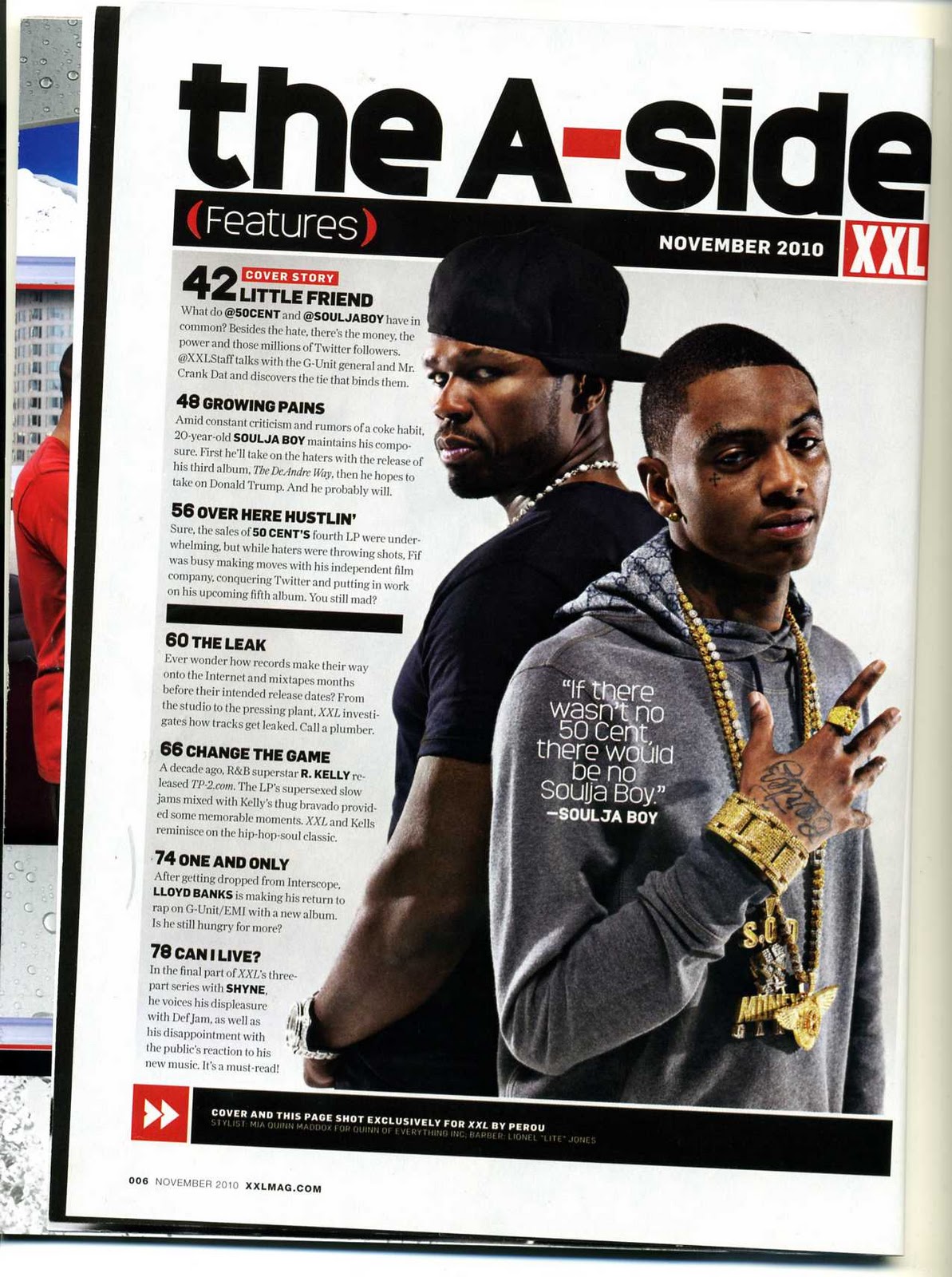
The contents page has another professional mid shot image of 50Cent and Souljaboy. This tells the audience they are the main focus of this issue of the magazine. The XXL logo is also on the contents page and it stands out because of it is bold and red. Again you can tell from the main image that this is an R&B magazine straight away. The contents are very clear and easy to read, they have a lot of detail compared to Mixmag and DJ mag. The website is also at the bottom of the page. Instead of labelling the page ‘contents’ they chose to put ‘the A-Side’ in very dark bold writing, this makes it sound more hip hop.

This magazine would appeal to a variety of different people worldwide of different races mainly people from a black background. I think you can tell that the magazine is American because of the language used in the text. It’s more of a male magazine as they are more interested in this kind of music and culture.

The double page spread has yet another professional planned photo of the rappers and the same representation is used. There body language is making them look as though they should not be messed with and are very serious. The main cover line has lots of swear words which have been blanked out but are still able to read, I think this has been done on purpose as this is the type of language used in this hip hop ‘gangster’ culture and they are using it to represent rappers. The layout of this double page spread is very plain and simple with no colour on the text. This also connotes seriousness.

Thursday, 11 November 2010

Music Magazine Genre

What is the chosen music genre, which your magazine will focus upon?

The chosen music genre which my magazine will focus upon is Dance & R&B. I think I will be able to take more original images with this genre.

What are the key features of this genre?

Dance and R&B music is mainly up tempo songs which are played in nightclubs and get people on the dance-floor. The lyrics are usually based on love, breakup, nightlife and crime. There are many key features of this genre such as; rappers, dancers, half naked women, sports cars, drugs, bling, ear piercings, black people, sunglasses, different fashions, baggy jeans, mainly British or American artists, male and female, good-looking, headphones, tattoos, sex and money.

What magazines, currently in publication, cover this genre?

I haven’t found a magazine that mixes both dance and R&B, but there are magazines currently in publication that cover R&B, the main one would be XXL and VIBE is also popular. There are also magazines that cover Dance the most popular are DJ magazine and Mixmag.

What features do they have in their magazines and how do these features tie in with their target audience’s expectations of representation?

In both XXL and VIBE the front cover is very simple, a plain white background with one main image of a popular artist. Both mastheads are red and the main image slightly covers them. In both magazines the main image is surrounded by very clear easily readable text. Both main images are very serious and both artists are wearing a vest, showing off their tattoos, this is expected in an R&B magazine. In the dance magazines, DJ and Mixmag, the main image is very bright and wild, they are both very colourful and represent dance music in a positive way as they all look as though they are enjoying themselves. Their target audience would expect these magazines to look like that and they can distinguish them straight away by looking at them.

What additional features could you put in your magazine to make it stand out and appeal to an audience that is not already being marketed to?

 My magazine will be a mixture of both Dance and R&B magazines, that means that some images will be serious and others will be fun. My magazine will be quirky and colourful making it eye-catching.


New Music Magazine Brief

I have been asked to create a new music magazine using at least 4 original images. The magazine must consist of a front cover, contents page and a double page spread. I will be using my own original ideas and it must have key concepts of a music magazine.

Friday, 22 October 2010

Evaluation of College Magazine


This is my new amended Front cover of my college magazine, I have changed the copyrighted image of a pumpkin to an original image of a hallween party.


My task was to create a college magazine front cover and draft a contents page. I decided to call my magazine ‘Wyke Focus’ this was to show what the contents of the magazine were about (Wyke associated). This magazine had to represent this college in a very positive way and had to have appropriate stories. I thought of many ideas for mastheads, images, selling lines and planned out a draft of my front cover. I then had to do some research into the happenings at wyke and think of some ideas for my cover lines. I then compared 2 other college magazines; ‘GX magazine’ and ‘College Lifestyle’  this gave me ideas as to what is conventional and unconventional. It helped me realise how to make your magazine attractive to the chosen audience.
     My college magazine uses many different forms of conventions such as putting a large bold masthead at the top of the front cover, I chose ‘Wyke Focus’ as this makes it clear as to what the magazine is actually about. I also chose to put the barcode at the bottom left hand corner of the front cover along with the price and college logo in the other corner. I used Purple and a yellowy green colour for my text as this represents Wyke college as it matches the Wyke logo. I put 2 more images along the left third of the front cover which is also a convention of a real magazine. The image of the girl on the laptop was taken to represent someone who is good at media, the other image of the pumpkin was to link in with the month (October) and the fact that there is a Halloween party nearby. I think my main image challenges forms and conventions of a real magazine because usually the model would be smiling but I decided to create a more peaceful image of somebody studying in the new grounds, I chose this photograph out of many because it promotes wyke in a more positive way that the other photos as it is a lot lighter and looks very attractive.
    My magazine doesn’t really represent particular social groups but it does represent students in a different way to usual, it actually shows the student studying in a peaceful environment and not with friends and it doesn’t show any teachers this shows students in a different way it shows them actually working by themselves which is more true to life because student do have to study by themselves a lot.
    The audience for my magazine is students mainly aged between 16 and 21 who live in Hull or the East Riding. This could also attract other students who don’t go to wyke who would like to know what the wyke lifestyle is like encase they decide to come to wyke in the future. The audience could also be staff at Wyke as they may want to know what’s going on at the college and what students are getting up to. Parents may also want to read this because they may want to know what there son/daughter is doing at college and what goes on whilst they are there.
     I used many conventions to attract my audience such as using a bright bold masthead and using other images of goings on at the college. I also chose a bright picture and short snappy cover lines to attract other students to read it.
    I used Adobe Photoshop to construct my front cover college magazine and draft of the contents page. I used a digital camera to take original images of students at Wyke college and chose which images out of the ones I took were best suited to the front cover of my magazine. When I chose my final picture I used image adjustments on photo shop to change the brightness and contrast of the photograph to make it look a lot brighter and more colourful. I created boxes to put the other images in and changed the colours and the fonts to make them represent wyke. I chose to change the colour of the box with the pumpkin in to black and changed the font and the font colour to red to make it represent Halloween as scary and sinister. I cut out a purple star and decided to change the colour to purple and put the text inside and used that as the main cover line. I think that my magazine was very simple to create and is looks very effective.
     In comparison to the other two college magazines I analysed, I believe that my magazine is more like a college magazine than ‘GX magazine’ because it shows students in a more positive manor and is a lot more attractive and colourful, I think that this widens the range of audience. My magazine does not look as professional as ‘College lifestyle’ because ‘College lifestyle’ is more glossy were as my magazine looks as though a student has actually created it themselves and I think that this is more effective and will be more attractive to other students. I wanted to represent the college in a positive way and I believe I have done that as it shows success, education, happiness and positivity.