

DJ Mag:
On the front cover of ‘DJ magazine’ the language used is very clever. The masthead is in the top right hand corner, it’s a very short masthead and it’s red and bold. This magazine is very conventional, the main image is a medium shot and covers some of the masthead, and this shows that the magazine is confident that it will still be recognised. The cover lines are on both left and right sides of the image covering the bottom half of the image. The colour of the cover lines match the masthead, they are all very clear and easy to read. The main cover lines are slightly bigger and bolder than the rest. The main image is very well thought out and professional it looks as though it was taken in a studio and the models have been dressed like that on purpose. The dress code is very camp and the men in the photos are wearing makeup. The colour of the cover lines match the colour of the clothes the models are wearing, this makes the front cover look mainly yellow and red and easily recognisable. We can tell from the front cover that this magazine is aimed at the younger generation, mainly ages 18-30 worldwide.
DJ Mag is a monthly magazine, first printed in 1991, dedicated to dance music. The magazine is available through newsagents worldwide, via subscription and as an online pdf. Each issue comes with a free CD. DJ Mag is currently published under licence by Thrust Publishing Ltd.
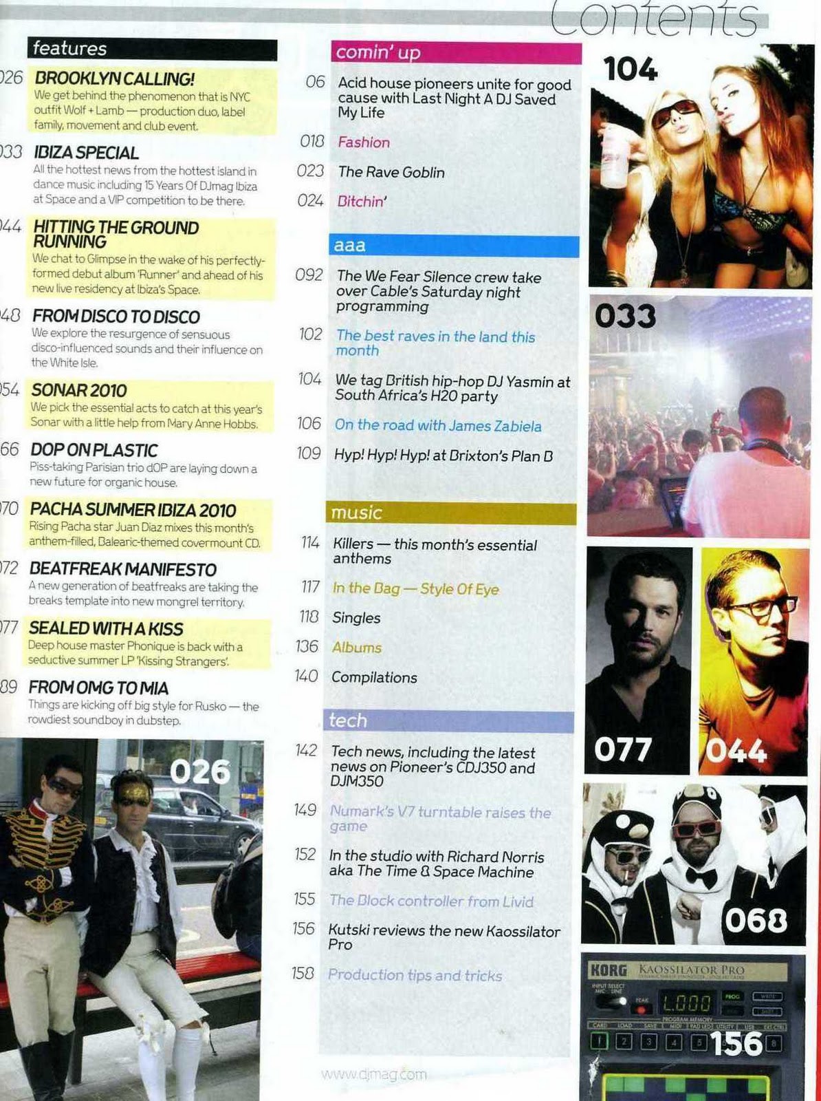
The contents page is very simple yet colourful and tells us exactly what we are going to be reading about in the magazine. It’s split up into 5 categories: features, Comin’ up, aaa, music and tech. You can tell that the magazine is aimed at younger people by the way the writers have spelt comin’ up. The Magazine represents the dance music industry and the nightlife surrounded by it e.g. productions/holidays (Ibiza ). There are images surrounding the contents and these images are mainly photos of DJs/clubbers aged between 18-30.
The double page spread uses much of the same language as the front cover and contents page. It’s kept very simple and the main image on the double page spread has the same models as the front cover and contents this suggests that they are popular artists and are the main focus of that pacific magazine.


Mixmag:
Mixmag has competitions were readers can win great prizes and gives the readers knowledge of big upcoming dance music events e.g. deadmau5. Mixmag was launched in 1982 and were the creators of the dance music magazines market.
*It is the market leader and has maintained its reputation as the most influential title in the dance sector. It created the words “superclub” and “trip hop”, released the first legal DJ mix tapes and CDs and is the most trusted voice in dance music.
Mixmag was acquired by independent publishers Development Hell Ltd in December 2005 and re-launched in April 2006.
Over the past six years the UK
The Burberry caps, downmarket “mates in a state” pictures and wall-to-wall drugs features are gone. In comes stylish, grown-up writing from some of Britain UK
Today’s clubbers are more sophisticated, more broadminded and – let’s face it – sexier than the days of the mega clubs and mass marketing. Mixmag is their magazine, reflecting their more cultured, more elitist but no less hedonistic approach to a good night out.
Mixmag will continue to come with its world-famous series of free cover CD’s mixed by the best DJ’s in the world.
Mixmag has a certified circulation of 30,817 and a readership of 276,000.
Mixmag continues to be the only audited dance/clubbing magazine in the UK
Mixmag is mainly aimed at the same audience as DJ mag – 18-30 male and female clubbers.
The contents page for Mixmag has an odd layout as there is a main image of 2 party goers in a club. It shows who the target audience is. This takes up most of the page and the cover line at the bottom explains the image, it says ‘your complete party guide’, this seems to be very conventional for a dance magazine. The background of the contents is black; this suggests that it’s a magazine about nightlife. At the bottom of the contents there is a list of songs which are on the CD the magazine gives free to every reader. So it isn’t just the contents of the magazine on this page. The Mixmag logo is also on the contents as is the issue date.
The double page spread from Mix mag is a mixture of text and images. There are 2 main images of amazing dance music shows and the images are very similar. One of the main articles is about Deadmau5 which seems to be a main focus throughout the magazine. I think these images advertise these types of events to their target audience because they make them look spectacular and people will want to go to them. The text is very plain and clear with lots of detail.


XXL:
The language is very plain and simple on the front cover of XXL. The background is a light grey which helps to make the black cover lines stand out. The main image is a very professional mid shot and looks very well thought out because of the costume, lighting and even the body language. The colour of skin, jewellery, tattoos and clothes all tell the audience instantly that this is an R&B magazine. The main cover line explains the image and tells the audience who they are. The masthead isn’t very noticeable in this front cover as some of it is covered by the main image and it looks as though its part of the cover lines. This shows that the magazine is very well known and doesn’t need to advertise themselves. The barcode tells us how much the magazine is to buy.
*In 1997, XXL was founded by former Source staffers as well as other Harris Publication employees, who wanted to create their own magazine about the hip-hop music and culture using the model developed by the founders of The Source. The magazine's past editors included Elliott Wilson (formerly of Ego Trip Magazine and The Source) and Datwon Thomas (former Editor-In-Chief of King Magazine). In May 2009 Datwon Thomas resigned from XXL and executive editor Vanessa Satten, who had been with XXL since 1998, was named the new Editor-in-Chief.
In December 2006, XXL took over the struggling Hip-Hop producer and DJ magazine Scratch (another publication owned by Harris Publications), re-branding it as "XXL Presents Scratch Magazine". Scratch shut down in September 2007. Other titles with limited runs have been launched under the XXL brand, including Hip-Hop Soul, Eye Candy and Shade45. XXL has released many other special projects including tour programs, mix tapes and exclusive DVDs. XXL also maintains a popular website, which provides daily hip-hop news, original content and content from the magazine.
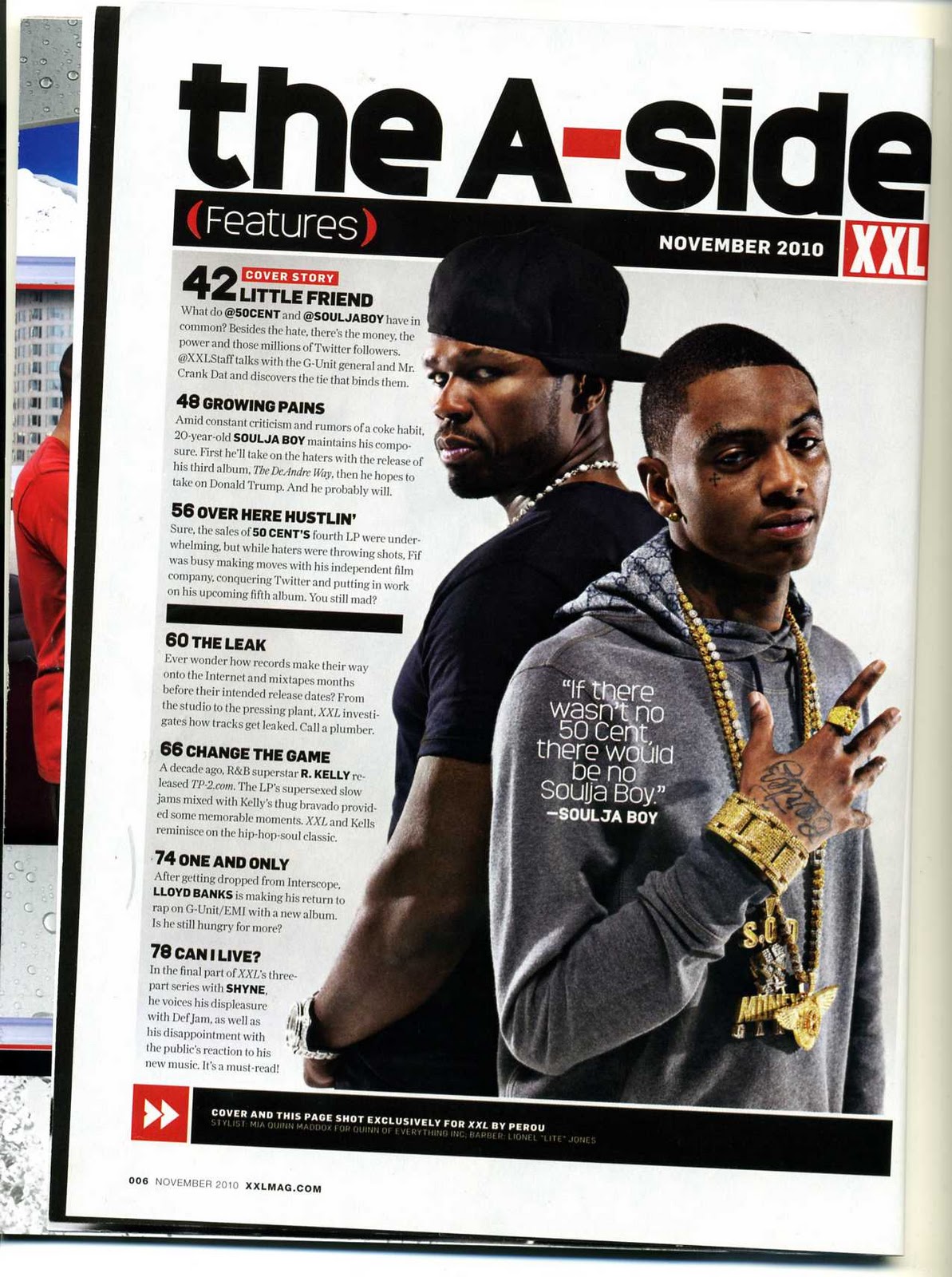
The contents page has another professional mid shot image of 50Cent and Souljaboy. This tells the audience they are the main focus of this issue of the magazine. The XXL logo is also on the contents page and it stands out because of it is bold and red. Again you can tell from the main image that this is an R&B magazine straight away. The contents are very clear and easy to read, they have a lot of detail compared to Mixmag and DJ mag. The website is also at the bottom of the page. Instead of labelling the page ‘contents’ they chose to put ‘the A-Side’ in very dark bold writing, this makes it sound more hip hop.
This magazine would appeal to a variety of different people worldwide of different races mainly people from a black background. I think you can tell that the magazine is American because of the language used in the text. It’s more of a male magazine as they are more interested in this kind of music and culture.
The double page spread has yet another professional planned photo of the rappers and the same representation is used. There body language is making them look as though they should not be messed with and are very serious. The main cover line has lots of swear words which have been blanked out but are still able to read, I think this has been done on purpose as this is the type of language used in this hip hop ‘gangster’ culture and they are using it to represent rappers. The layout of this double page spread is very plain and simple with no colour on the text. This also connotes seriousness.
No comments:
Post a Comment